2026
Overview
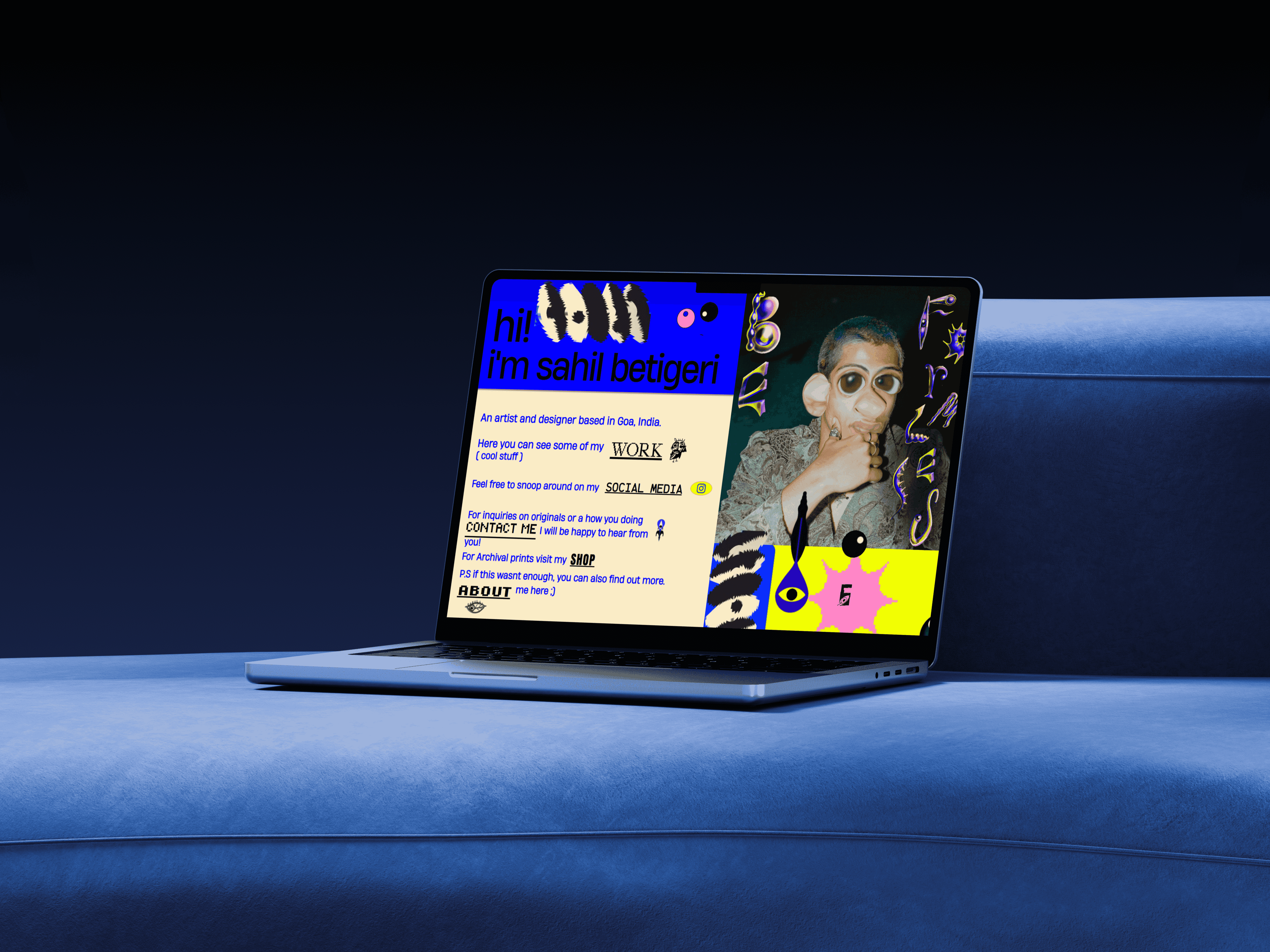
A one-day mobile layout pass for a portfolio built around dense, overlapping artwork and animation, restructured to hold that same density together on a phone screen.
Client
Sahil Betigeri
Type
Visual Art / Layout & Responsive Design
Duration
1 day


The Challenge
A site built around dense, overlapping artwork and animated GIFs doesn't just shrink down to fit a phone screen.
Sahilfromnature carries a lot of visual weight on one page: paintings, animation, and publication work, staged close together in a layout built for a desktop screen. That density is part of the site's character, but on mobile it meant images overlapping, animations breaking stride, and a page that stopped feeling designed and started feeling like an accident.
The solution
We rebuilt the mobile layout section by section, so the same density reads as intentional instead of broken.
Rather than scaling the desktop layout down, each section was restructured for a single column, with spacing and image sizing adjusted so the artwork still felt considered rather than crowded. The site stayed exactly as visually busy as it's meant to be, just legible on the screen most people are actually going to see it on.